This series of images were requested for a PR company that specialised in PR for companies dealing with interiors. The brief was rather vague, other than to get a variation of images, including details. The guidance would come from the builder and owner.
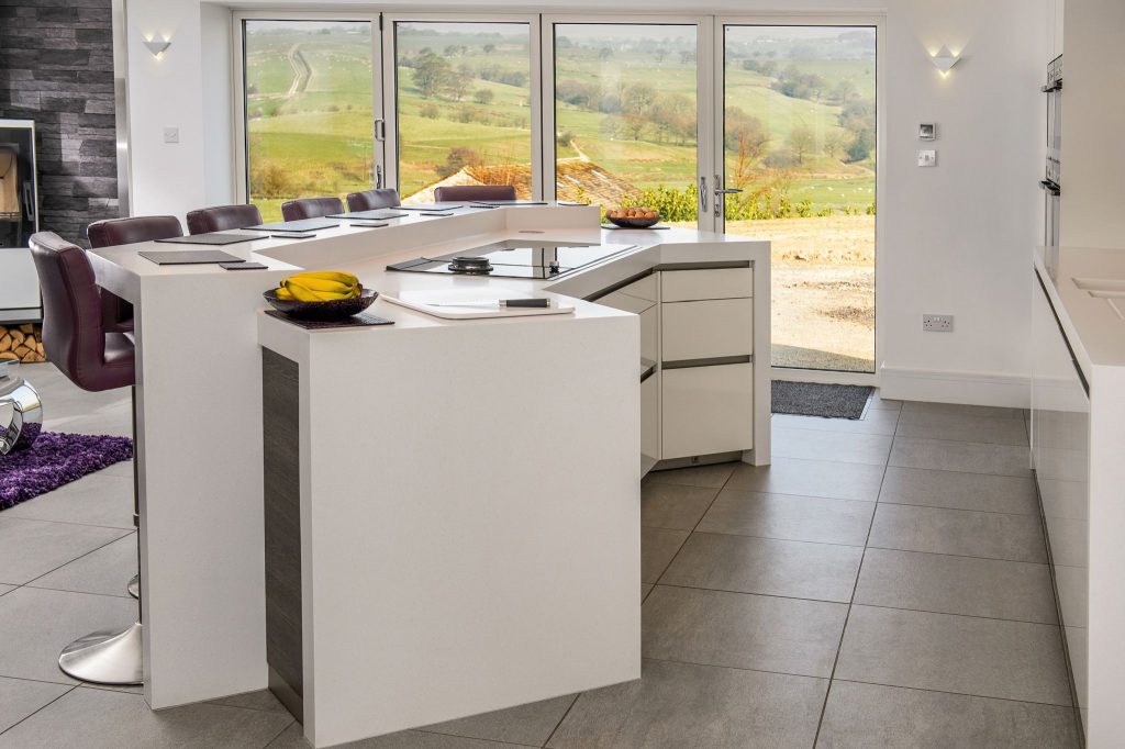
The first image I wanted to get, was the initial view I had as I walked into the kitchen diner. That wonderful view through the panoramic doors was an obvious talking point, and also my biggest headache! Besides the usual issue of wanting to retain the view through the patio doors, it was also my only source of light into the room. Consequently, the island unit was quite heavily in shadow on my side, and there was little light on the side of the island that faced the cupboards frame right.
Adding light to a scene can be problematic, as the increased light near the light source can be quite obvious if not carefully managed. Usually it shows on ceilings and walls, creating an unnatural scene. As I needed to show the island unit in full, and the fact I couldn’t go any further back without showing the edge of the entrance, it meant the ceiling wasn’t in frame. I therefore had a lot more freedom with regards to the lighting.
Normally, a white shoot through umbrella is ideal in doors. But here, I needed better control, so the light could be directed and also concentrated. I chose to use a 120cm Octa, and placed it frame left and as far back from the island unit as possible. Yes, it means the light would have to work harder, but it also means there wouldn’t be a noticeable falloff from the frame left side of the island and the wall cabinets frame right. The Octa was attached to a 600Ws location light, firing at 1/8th output.
This gave me a perceived correct exposure of 1/125th sec f7.1 ISO200. I then took three exposures at ISO 100, 200 & 400, allowing me to manually blend the window so as to match the internal exposure better. I also had an over exposure with the ISO400 frame, allowing me to add detail to any particularly dark shadows.
If you look carefully, I’ve just noticed there is a giveaway of the additional light frame left, caused by a splash of light across the corner of a cabinet, which leaves a shadow on the wall.
Damn!
I sometimes use additional speedlights for fill, if there are alcoves, or other dark areas. That wasn’t an issue here, and the one location light seemed to do the trick quite nicely.
1/125th sec f7.1 ISO 100, 200 and 400.
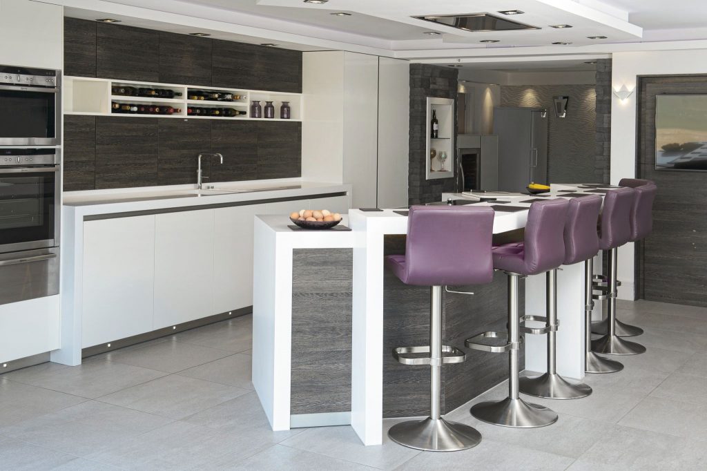
This was taken from the outside, through the open patio doors. The light is mostly provided by that same 120cm Octa in pretty much the same position, but now firing towards the room entrance where I took the first image from, and firing at the same output of 1/8th. This is a single frame, as opposed to the first image’s blend of three . However, I needed to increase the aperture to ensure I had sufficient depth of field for the room beyond. To compensate, I increased the ISO, which compensated for the aperture change, and also used a lower shutter speed to capture more of the ambient light in the room beyond.
1/60th sec f10 ISO400
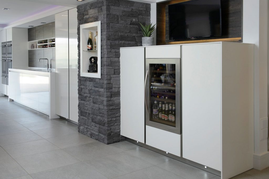
This image was taken without the additional light. As there was sufficient light from the patio doors, and the units were lit quite evenly, this was taken as single frame.
1/60th sec f5.6 ISO400
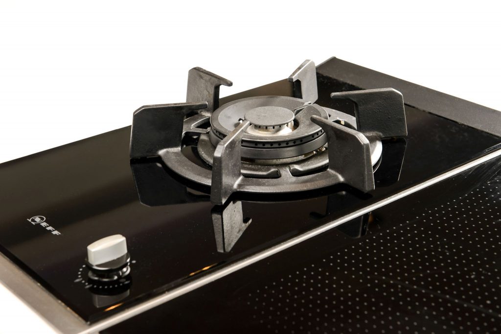
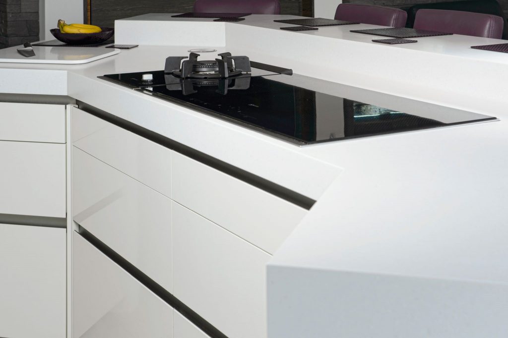
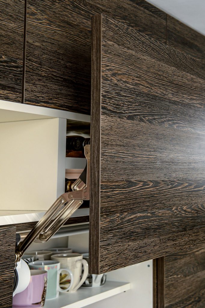
These are some of the detail images I mentioned. They were shot at ambient, and generally at ISO400 1/60th sec and f10, except the last image, which was f7.1
