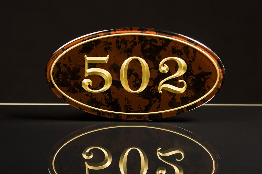
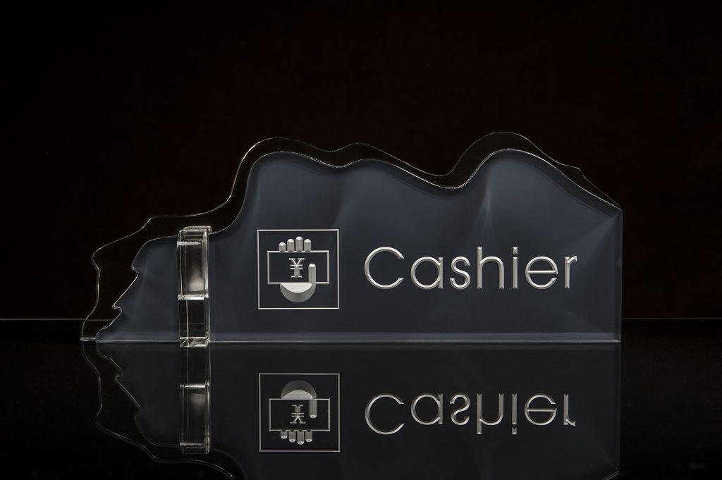
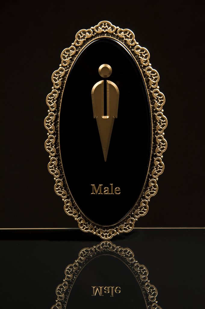
As products go, these signs had their own set of challenges. The main thing I wanted to preserve, was the three dimensional nature and depth of the acrylic. The numbering was quite pronounced within the plastic, and I wanted to make sure that was obvious to the viewer. What I didn’t want, was any glare or flaring caused by the highly polished perspex.
Rather than photograph on white, I wanted the quality of the product to be enhanced by it’s surroundings. A real reflection as opposed to the post production examples often seen, and not always particularly convincing.
I attached a plastic rod with blu-tac to the back of the sign, and the blu-tac’d the rod to a sheet of black glass (an ex black glass coffee table top, liberated from a skip). The black glass would give me the reflection I was looking for, but it had to be absolutely immaculate, as the light will pick up any dust etc.
The backdrop is a grey paper. Without lighting the backdrop, it’ll naturally go much darker. There is some light being bounced from the glass table wich is providing some slight illumination on the background paper, which is why it isn’t black. However, there is no direct light on it.
In line with the sign and frame right, I placed a 200Ws head firing through a 40cm beauty dish with a grid fitted. It was firing at 1/8th output.
A second 200Ws head firing through another 40cm beauty dish with grid fitted was placed frame left and inline with the sign. Again firing at 1/8th output. Both were angled downward at around 45 degrees. These gridded lights caused the numbering to stand out in relief to the sign background, giving them shape and texture.
A 300Ws head was placed directly over the camera, firing through a gridded 70cm beauty dish at 1/16th output. This provided the main lighting for the scene, and helped the reflection become more prominent in the glass.
Wondering about the horizontal line? It’s the edge of the glass. I had originally intended to take it out in post, as I have done before with other products. However, I felt it added to the image rather than distracted, and gave the client the option. They chose to retain it.
1/125th sec ISO 400 f10
A couple more images from the same session. Nothing really changed between each, other than slight movement of the accent lights to ensure features were highlighted correctly.
Budget version:
This could be managed fairly easily with speedlights. The main issue is substituting speedlight friendly modifiers. That said, there are now an awful lot of adaptors that will take studio modifiers, such as the one from Godox, or any of the re-branded versions. Because the lights were so close, you would probably only be shooting at ¼, possibly ½ at the most.
I provide training via Focal Point.
