How many times have we heard “If only I could afford better!”, or something similar. I had a recent conversation regarding lighting equipment, and the subject inevitably turned to cost. I don’t really subscribe to the idea expensive=better. Sure, you tend to have more features etc, but the ability to make the image in your head into a physical print is down to the skill of the photographer. A response I often use in these sort of conversations. This time I got the “It’s ok for you, you’ve got your Pro lights.”
Hmmmm, was I missing something? Can cheaper lights produce pro quality images, and can a high quality image be produced both in the studio and a home environment. In all honesty, I felt I knew the answer to the first question, as I’d seen a lot of examples from Lencarta SmartFlash owners on a number of forums such as Talk Photography. Now, as to whether I could duplicate the results in a less controlled environment; Well, that was going to be the real challenge!

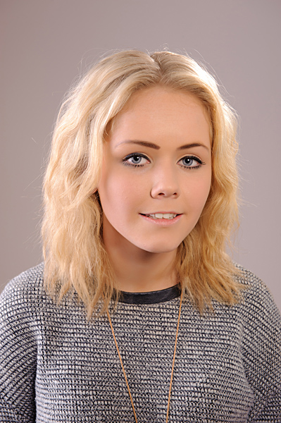
The above image shows the setup in the studio, which actually gave me the finished image at the start of this blog entry (Incidentally, that image is the only one to be fully worked up. All other images here are straight out of camera, with only conversion from raw to jpeg via Lightroom 3).
 Three SmartFlash heads, all utilising different modifiers. The key light was a 40cm white beauty dish fitted with the grid. The fill light is provided by a 120cm folding octabox, camera left. The hair light is a standard reflector with a 30 degree grid fitted, which is further back from Libby,the model, and you can see it in the above image.
Yes, you will notice the modelling lights are on, which isn’t a good idea when using grids, as it tends to stifle the vital cooling air flow, and can result in a rather expensive bang should a unit over heat over a long period of time. This is applicable to all heads, but especially some of those cheaper heads that have no cooling fan and rely on a heat sink! The SmartFlash units are all fan cooled, so I was more than confident to take my time setting up using the modelling lights and then step back to photograph the setting before turning them off on the gridded heads.
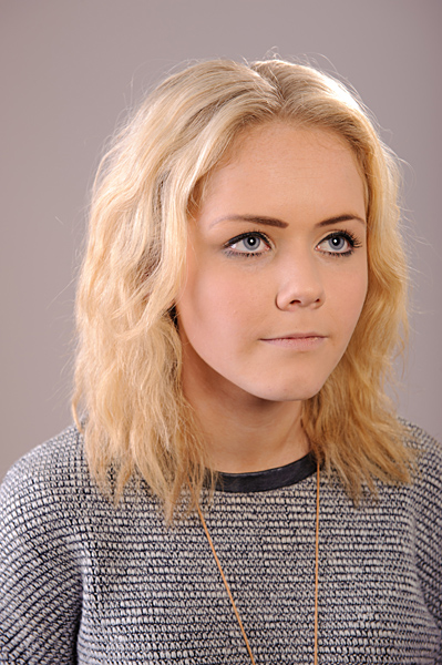
This is a fairly classic beauty dish shot, with the circular catchlights and the cheekbone emphasis. The hairlight (seen frame right, or Libby’s left), is harsh, due to the lack of diffusion, but it’s essenntially more of a rim light anyway. The fill light, on the other hand, is provided by the 120cm octa. A nice soft look to Libby’s hair and the spill across her right cheek.
Nikon D3 1/125th sec ISO200 24-70mm f8
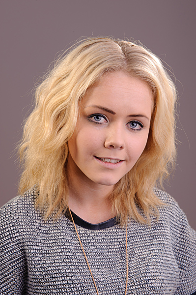
In this image, I swapped the position of the Octa and the beauty dish. A number of things become quite apparent. The overall lighting of Libby’s face is much softer, and the fill light across her hair has become harder due to the gridded beauty dish. In fact, her hair has become better defined.
Nikon D3 1/125th sec ISO200 24-70mm f11
ok, time to move out of the studio, and see if I can duplicate the results in a home. This should be fun!

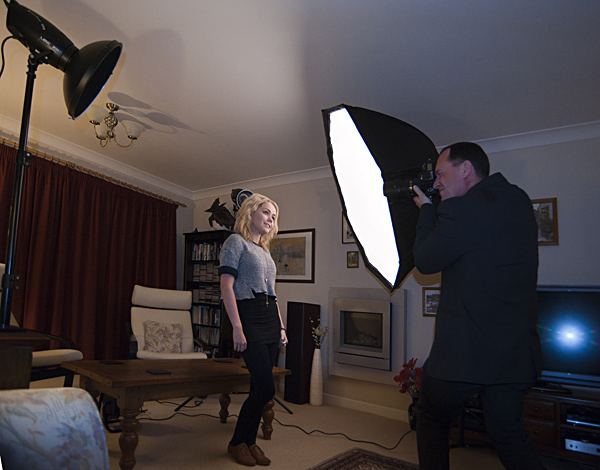
ok, the above shows the same sort of layout and setup as we used in the studio, but the room itself was darker than the studio, and had a few more items in it(?), but these are the sort of challenges we are likely to meet if visiting clients in their home anyway, so no point dwelling on it. The following image probably better shows the light positions used.
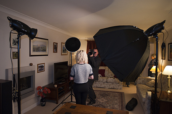
As I was setting up the lighting, this time I remembered to take a shot with the fill and hair lights only, so as to better show their effects (Confession time : I actually forgot to switch on the light cell on my key light, duh!) . Again, I’m starting with the exact same configuration, which is the 40cm beauty dish and grid for the key light, the 120cm folding octa for the fill, and finally the standard reflector and 30 degree grid for the hair / rim light.
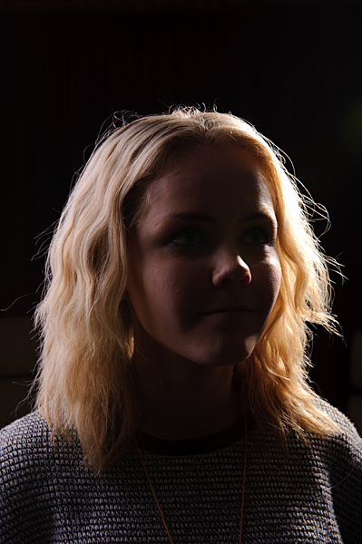
Again, you can see the softer light from the octa as it light’s Libby’s hair and spills across her right cheek.
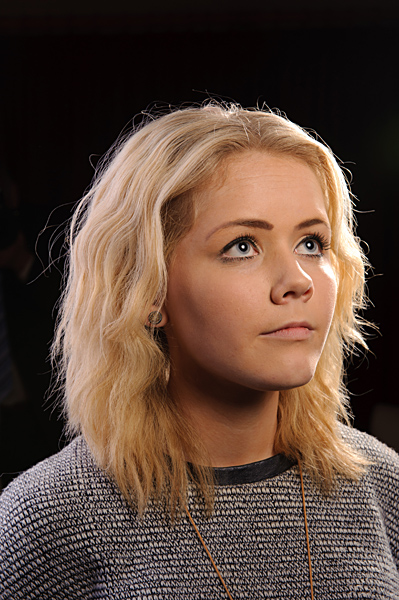
And with the beauty dish included (Well, ahem, switched on), you can see the effect of the BD light skimming across her cheek and accentuating her cheekbone. There is shadow in the previous shot, but a little further back towards her ear, and caused by Libby’s hair, which is a much softer shadow. The cheekbone shadow is much better defined in the above image.
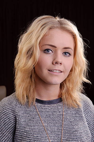
And with the Octa swapped for the beauty dish.
Nikon D3 1/125th sec ISO200 24-70mm f11
I would highly recommend the SmartFlash units to anyone wanting to get started with studio flash work, whether in a studio or home location. Extremely simple to master, and I think the results speak for themselves. As for modifiers, I chose the three that would give the widest possible range of options, although I would also recommend a shoot through brollie and a reflective brollie too.
There is a basic introduction to studio lighting available via www.focalpointpro.co.uk


[…] Entry Level Studio Lighting in the Studio and Home […]