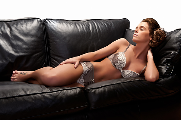
Further to my last post, and continuing the development of images for the Lencarta catalogue, I had another opportunity to work with Nicola, one of my favourite models. I originally met Nicola when I photographed her wedding in the summer of 2010, and we’ve been good friends ever since. I’m not sure if it’s the circumstances of our first meeting that influenced the nature of the assignments we would collaborate on, but this time we had a different agenda. As usual, I had two clients for the same shoot, in an attempt to get the best value for all those concerned. I’ve already mentioned Lencarta, and the second was Nicola herself as she wanted a wider range of images for her portfolio.
The above shot was conceived for a lingerie section for Nicola’s portfolio, but during the lighting development, I decided it would actually be perfect for the catalogue too, albeit from an elevated viewpoint to include the light modifier.
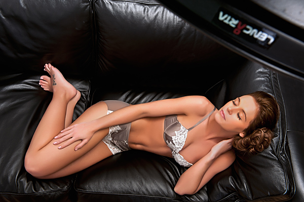
Initially, I boomed a 200 x 40cm gridded stripbox above Nicola. It lit Nicola quite well, but just didn’t seem to “hit the spot” as far as my original concept. I had quite intense shadowing in front of the settee, and the settee itself had areas of poor definition on the leather surface. I swapped the stripbox for a gridded 70cm white beauty dish and the change was fairly dramatic. Although it was gridded, the fact the beauty dish is much wider than the stripbox meant the shadow in front of the settee was now confined to being underneath, rather than in front of it. The leather of the settee itself was far better defined too, and the light along Nicola was also more pleasing.
Now we had the main light sorted, I also wanted some fill from the front, or camera left to be exact. I chose to use a Profold 70 x 100cm softbox with the head at around five feet. Both modifiers were mated to Elite Pro 300 heads. The beauty dish was at around ½ power and approximately 4 feet above Nicola, whereas the softbox was around 7 feet away and still set to ½ power, providing a softer fill and a little highlight along the front of the settee.
Oddly enough, I didn’t like the final image that showed the full settee in frame, and much preferred the closer shots.
Nikon D3 1/125th sec ISO200 24-70mm f20
This is the image intended for the Lencarta catalogue, taken from a higher elevation to include the edge of the beauty dish and the logo. I used a SmartFlash coupled to a standard reflector and a 10º grid to light the logo. Output on the SmartFlash was set to almost full power.
Nikon D3 1/125th sec ISO200 24-70mm f20

This is the setup shot.
Nikon D3 1/125th sec ISO200 24-70mm f18

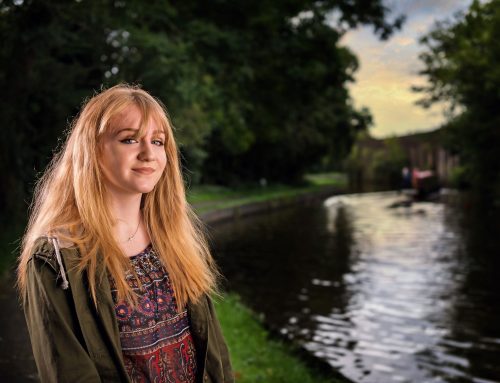
[…] was part of the portfolio shoot I did for Nicola Sumner, a young lady I’ve worked regularly with, especially wedding venue brochure shoots. […]
[…] was part of the portfolio shoot I did for Nicola Sumner, a young lady I’ve worked regularly with, especially wedding venue brochure shoots. […]
Im loving the 70cm lencarta beauty dish. I went for silver but what’s the difference re white version?
Pete
A lot of photographers swear by silver finished dishes. They are very contrasty and give a really crisp light. However, if your model isn’t late teens or early twenties, with a perfect complexion and perfect makeup, the white finished beauty dishes are far more forgiving.
I find models that meet the above criteria tend to form around 10% of my clientèle, so I would rather spend my money on equipment that I can use on the 90%. 🙂