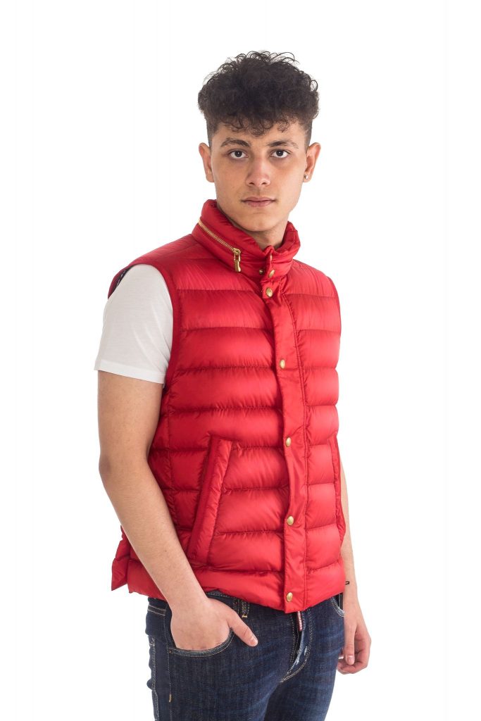
Fashion photography can be a funny old thing. You meet with the client and they have a good grasp of what they want. They want the detail to show, and the quality to stand out. Great, that means they aren’t going to go for that full on flat lit look, so often seen on their competitors websites. Something to look forward to.
And………………..
It all kinda goes poo shaped.
They’ve brought some images from their main competitor, and they want to emulate the look. Right down to the last tiny detail. And it’s flat. Flat kinda flat.
I take the time to explain that having a light on each front corner of the paper, just fills in all the shadows and flattens any kind of texture or shape.
*Blank look* from the client.
So I set up as requested and take a shot, and they say “Great!”
Meh!
So I introduce a soft accent frame right, and have it barely above the keylight. So subtle, it only just lifts the highlight on the clothing. I switch one of the front keys off, and bring the other more central. And we now have a little shaping to our model’s face, and we can see how the padding of the gilet is actually quite pronounced. Compare that to the requested flat lit image below.
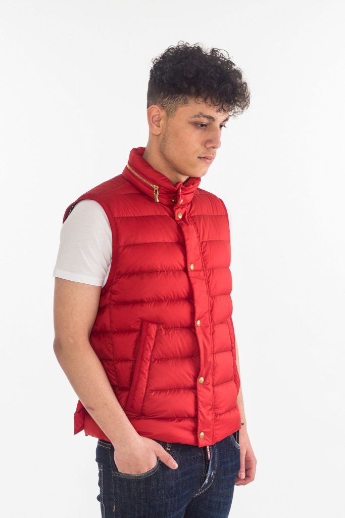
The above image wasn’t edited, as it was the initial light test to the client’s original brief.
I also added a second accent light frame left, and again it was barely brighter than the keylight, but added just enough separation too our models arm, frame left.
So, to the lighting.
The background was lit either side with Elinchrom heads, each firing into white reflective umbrellas, and each at an output of 3.0 (Equivalent to 50Ws).
Frame left is a 300Ws head, firing through a honeycombed stripbox at an output of 50Ws.
Frame right was a second 300Ws head, firing through a stripbox, but no honeycomb. It was also brought forward so as to play across the model’s chest as an accent, giving more detail to the gilet. Again, output was around the 50Ws mark.
The keylight was a 600Ws head, firing into a 6′ white lined jumbo parabolic umbrella. It was placed a fair way back, allowing for the model to be able to move freely backward or forward, without unduly affecting the exposure value of the light. The output was at 100Ws, although it appears less pronounced on the model compared to the accent lights, due to the distance involved. (Inverse square law, and all that!).
Olympus E-M1 1/125th sec ISO200 12-40mm f2.8 @f9
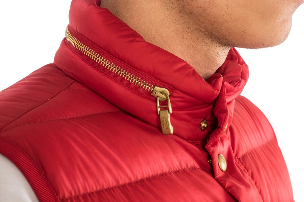
And this is a detail shot for the zip and padding, but shows the effect of the soft accent lighting quite nicely.
Same lighting and camera settings.
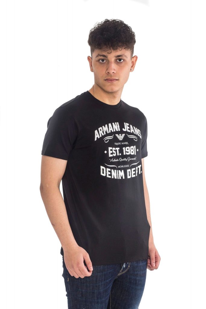
Change of attire, but same light and camera settings.
The client agreed the garments had a more attractive look, and as he put it, they also looked “real”.
